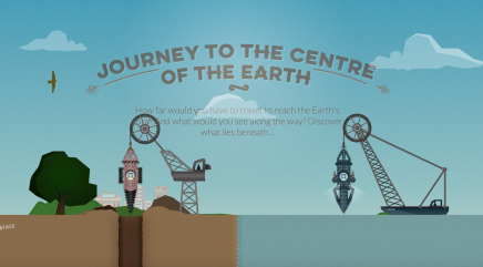
Journey to the Centre of the Earth
How far would you have to travel to reach the Earth’s core? And what would you see along the way? Discover what lies beneath…
Really stylish example of long scroll to deliver learning content. Via BBC
How far would you have to travel to reach the Earth’s core? And what would you see along the way? Discover what lies beneath…
Really stylish example of long scroll to deliver learning content. Via BBC
Google Feud is an interesting online game using Google autocomplete. It is a good way to open a discussion into data mining and taxonomy.
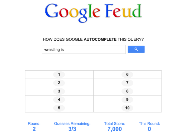
The game, by developer Justin Hook , is fun and surprisingly addictive. It harnesses the mystery of Google’s autocomplete search function, asking players to choose the next word in a broad query such as ‘Google…’ or ‘I love my…’, the game gives users three chances to complete the leader board, giving a big X with every wrong answer.
What’s interesting about this game is the ease with which it could be used for data mining. If the guesses are recorded and sorted by frequency, it could supply huge amounts of useful data; all from real people, giving their best guesses.
Sorting this data using techniques like those used in taxonomy and cladistics could reveal results to improve future search or autocomplete suggestions. I guess it’s a fairly safe bet Google do this type of thing, and much more, with their search data already.
Now imagine an online retailer selling thousands of products. If data is mined from the searches customers type, rather than from the point of sale, useful information could be gained to reveal the ‘real world’ language customers use to describe what they want. For example imagine two different customers entering a search, one uses ‘laptop bag’, the other ‘laptop case’, would you expect them to get the same products displayed? Or customers searching for ‘lightbulbs’ when the retailer has what they want all categorised as ‘lamps’. Change the categorisation to match the search term frequency and it’s fair to say sales will likely increase. And searches that give a zero return would reveal what a customer wants to buy that the retailer doesn’t stock.
A final thought. Here’s a different, and equally fun online game. Anton Wallén has created GeoGuessr, an experimental game that drops players into a location in Google Street View and challenges them to guess where in the world they’re located.

Could useful data be mined out of it?

The Guardian has put together this interesting interactive photo series to illustrate the effect of the ever-changing London skyline and how new construction of larger and taller buildings will change it. The Gherkin, The Shard, The Leadenhall Building (the Cheesegrater), The Heron Tower, and 20 Fenchurch Street (the Walkie-Talkie) have made their mark on London, but there are many more to follow.
From an education design perspective it’s interesting to come across the use of self-discovery to help engage with the message and learning content.
Whilst on the subject of these new buildings, here’s a beautifully shot time lapse of the Cheesegrater being built by filmmakers Dan Lowe and Paul Raftery.
Interesting way to show the daily complexity and volumes of air traffic across the UK and Europe in a way that is both cinematic and exciting to watch.
From the NATS blog at: nats.aero/blog/2014/11/take-guided-tour-uk-skies/
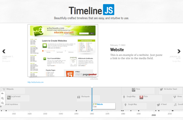
Lovely example of an interactive timeline. I was looking for a way to present company history. This might be it.
Thank you VéritéCo. Click Here.
